Intercambio
Fred & Tania
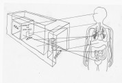
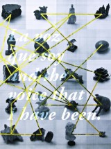
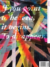
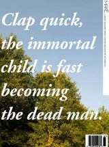
Por by Tania Candiani with Fred Sasaki
Por by Tania Candiani with Fred Sasaki
Get future issues or buy back issues.
Make a tax-deductible donation today and help us continue to publish online and in print. No contribution is too small.
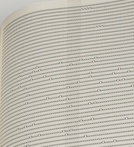
Figure 4. Tauba Auerbach, Alphebetized Bible (detail), 2006.

Figure 5. Tauba Auerbach, Binary Lowercase, 2006.
Palindromes, ligatures, anagrams, and alphabets give both abstraction and elucidation to Tauba Auerbach’s voluble compositions. Influenced by her training as a sign-painter in San Francisco (her homebase and 1981 birthplace), her steady strokes of gouache, ink or acrylic on paper become visually effervescent puzzles comprised solely but decoratively of language. Despite calligraphic flourishes, Auerbach’s work is every bit as confrontational as her semiotic predecessors. Her balanced treatment of meaning and its appearance prepare the symbols of communication for cultural, historic, aesthetic, and philosophical significance. Ranging from the idiomatically familiar study of phonetics to obscure forms of forgotten origin, each piece tests the nature of human’s desire to communicate.
Auerbach keeps her designs theoretically tempestuous but clean as a whistle. She combines blocky, Bauhaus chromatics and the razor-edged curves of Russian Constructivists with Kurt Schwitters’ wordplay and Fluxus utility. What results is a consistently moderated layout of optical illusions that simultaneously contradict and abide the laws of language. They often have an album-cover appeal, with words spaced in cadence and lit in colors such as hot pink, wood, and bluejeans. Having started studying signs while employed to make them, Auerbach’s art was never subservient to theory, but rather a hands-on navigation of thought, captained by her own curiosity.
As with breaking a molecule, communication can be deconstructed ad infinitum. Auerbach often enters through etymology to then occupy formal grounds. The ampersand has a prominent presence in Auerbach’s work and can be thought to represent her dedication to making connections between meanings. The story of the ampersand is parabolic, indicative of the incursion with accident that becomes language’s profundity. Cicero’s friend Marcus Tiro most likely invented the “&” around 67 BC, colliding the cursive “e” and “t,” which together spell the Latin word for this valuable conjunction. The English word “ampersand” appeared in Old English texts as a corruption of “and per se and,” as early as 1837. Bracketing per se designated that the sign or symbol by itself means “and.” Like many of Auerbach’s compositions, it is a message of perfect self-reference. And yet, as demonstrated in the blunt focus of pieces such as And Per Se And (2005), the essence of & is inclusive, purposed as a conjoiner and poised in expectation of another reference. The ampersand is an additive and it is an addict. By itself it asks for more.
The ampersand also implies a duality of sameness or contradiction that Auerbach explores in many of her works. Color-coded letters in Anagram I (2006), for example, guide the eyes as they calculate two statements of the same thirteen letters and significance. Divided algebraically, the top reads “eleven plus two” and the bottom answers, “one plus twelve.” Like Joseph Kosuth’s 1965 Five Words In Green Neon, the piece concludes in surefire honesty, meaning just what it says. Auerbach’s arrangement, however, suggests manipulation with two truths that look different depending on one’s phrasing. Infusing symbols with meaning as she strips them away, logic systems are broken down to their familiar yet unknowable components. Sometimes the equation creates a mystical or paradoxical call-and-response as in The Answer/ Wasn’t Here (Anagram III), (2007). (See Fig. 6.) An anagrammed rearrangement of The Holy Bible applies a logical and ordered system to the narrative of faith. Titled Bbe ehHi HoTy (2006), Auerbach’s book alphabetized each letter in the King James’s Bible, its capital letters bubbling up like pendants on a silver chain. (See Fig. 4.) Though the system is logical, the pages have been given an abstract meaning of patterns, different and less powerful. Exposing the linguistic attitudes towards absurdity and rationalism (and under the pseudonym, Eton Corrasable), Robert Smithson wrote in 1967:
The scale of a letter in a word changes one’s visual meaning of the word. Language thus becomes monumental because of the mutations of advertising. A word outside of the mind is a set of ‘dead letters.’ The mania for literalness relates to the breakdown in the rational belief in reality. Books entomb words in a synthetic rigor mortis, perhaps that is why ‘print’ is thought to have entered obsolescence. The mind of this death, however, is unrelentingly awake.
Auerbach’s obsessive translation of Bbe ehHi HoTy reads with a manic non-literalness, a rational belief in a system taken to an unreal extreme. While these linguistic trials have roots in structuralism, their conclusions illustrate language’s utter malleability.

Figure 6. Tauba Auerback, The Answer/Wasn’t Here (Anagram III), 2007.
The downwardly shrinking dissipation of a single letter’s readability in Auerbach’s “Eye Exam” series, equates similarity with sameness. Referencing Roger Catforth’s Long Distance Vision card (1970) as well as Smithson’s pencil drawing, Heap of Language (1966), these compositions scrutinize a symbol’s capability of being visible while referring elsewhere, or being visible but not understood. In Eye Exam I (2005), Capital Q’s fall like bombs, testing how well we can see and how much superfluous repetition we can bare.
These pieces are as crisp and direct as those of the linguistically trained artist Kay Rosen’s who, for over thirty years, has primarily stuck with sans-serif to paint intentionally redundant pieces like Your Eyes Say Yes (2004). Presenting language as billboards, silk-screened text, paintings, and drawings, Rosen also shares formal qualities with Weiner but is more conceptually on par with the likes of puzzle-master Will Shortz. Though both Rosen and Auerbach use chromatic parings to extract clever wordplay, Auerbach’s repartee often favors science over pun and alchemy over analogy. She returns to examination in another series that systematically pulls apart alphabets and numbers. Negative spaces removed and splayed on paper for anatomical examination, The Whole Alphabet, From the Center Out, Digital V (2006) and Uppercase Insides (2006) gives visibility to emptiness. With a slight nod to Derridian erasure, it is a chance to study the unseen. To direct the eye in opposition to perceptual norms gives a sense of choice to the viewer, demonstrating how sight has reversible ratios.
Several of Auerbach’s repartees ring with imperceptible sound. Listen/ Silent (Anagram III) comes as a command as well as an auditory impossibility. The rearrangement of the same six letters brings us from how we hear to what we hear and the equation insists that it is the same. Like John Cage’s 4’33”(1952) (consisting of four minutes and 33 seconds of silence filling ears with ambient sound and the thrashings of their own internal organs), the anagram formulation can be proved true on paper but flounders in reality. Sound also comes into play in compositions that resemble musical notation and phonetic pronunciations of the alphabet (“Kiew Ar Es”) that read like poems of a foreign tongue. Auerbach’s Alexander Melville Bell’s Visible Speech (consonants) (2006) goes into the mouth of speech and to the eyes of the deaf with an alphabet that Alexander Graham Bell’s father invented to help his hearing-impaired students with their accents. The deaf are given a language pressed by teeth, dark and bulbous. Arranged in tight, stacked rows, the symbols look like Arabic moons, wishbones and the moustaches of the debonair. One can’t help wonder how we would design it differently today.
Other archaic or less eminent alphabets Auerbach explores include Ugaritic, Morse, and Semaphore. The most familiar alphabet is Binary, and its notoriety has a persistent yet invisible presence in our lives. Unlike the ampersand, the language symbols of computers are disarmingly simple combinations of 1s and 0s, producing a battalion of verbal functions. Auerbach weighs the ethical implications of a system that excludes ambiguity. The art critic Leah Ollman explains how the wordless crossword configurations formed by binary uppercase and lowercase letters and the varying grey arrangements of Auerbach’s “50/ 50” series “celebrates the ingenuity of those systems but also exposes their limitations— the inability, within the binary system, for instance, to ever reach gray from black and white, to set the toggle switch to maybe.” (See Fig. 5.) One as a unit and zero as absence, the translation is not into yeses and nos. It is “Yes” and “Not Yes” that governs our digital world and suggests that all information is black or white in its essence. Opposition as just a diluted form of acceptance reveals an important characteristic about two-party systems. The choice between Coke or Pepsi, Republican or Democrat, echoes loudly in democracy because the chamber is tight. In other linguistic manipulations, Auerbach traces passages from “Yes” to “Not” or “No,” discovering paradox in assertions of finality.
Analyzing language means taking things literally. Though revelatory in illustrating how signs and signifiers pass the connotative buck, in many ways the conceptualist deconstruction was too architecturally obsessed to look beyond its own blueprint. In 1977, Michel Foucault insisted,
The whole relentless theorization of writing which we saw in the1960s was doubtless a swansong. Through it, the writer was fighting for the preservation of his political privilege; but the fact that it was precisely a matter of theory, that he needed scientific credentials, founded in linguistics, semiotics, psychoanalysis, that this theory took its references from the direction of Saussure or Chomsky, etc., and that it gave rise to such mediocre literary products, all this proves that the activity of the writer was no longer at the focus of things.
Auerbach doesn’t theorize without acting. In terms of ownership, she recognizes inequities and sees social kindness and education as proactive encouragements of change. Several years ago she worked on a homeless project where rather than just giving someone a dollar or theorizing on their plight, she would engage with the people, painting a provocative sign for them to replace and empower their previous sign of solicitation. As a sign-painter, it was something immediate she could do to help.
It has long been presumed that there is a battle raging in our minds; a hemispherical division between the right’s aesthetic and the left’s written priorities. By combining the power of language with visual mediums, Auerbach fortifies our corpus callosum, bringing holistic understanding and pacifism to the field of linguistics. While grammar might yield the most authority, the inconsistencies of language, irony, and metaphor burn fissures in logic through which we can breathe or fall through. In this maelstrom of alphabets, symbols, and punctuation, Auerbach converts suspiciously arbitrary marks to moments of conceptual revelation.
Dustin A. Beatty, “Speak Easy: Both on the Surface and Below, The Art of Tauba Auerbach Has Something to Say,” Anthem No. 24 (September/ October 2006): 79-81


click to see who
MAKE Magazine Publisher MAKE Literary Productions Managing Editor Chamandeep Bains Assistant Managing Editor and Web Editor Kenneth Guay Fiction Editor Kamilah Foreman Nonfiction Editor Jessica Anne Poetry Editor Joel Craig Intercambio Poetry Editor Daniel Borzutzky Intercambio Prose Editor Brenda Lozano Latin American Art Portfolio Editor Alejandro Almanza Pereda Reviews Editor Mark Molloy Portfolio Art Editor Sarah Kramer Creative Director Joshua Hauth, Hauthwares Webmaster Johnathan Crawford Proofreader/Copy Editor Sarah Kramer Associate Fiction Editors LC Fiore, Jim Kourlas, Kerstin Schaars Contributing Editors Kyle Beachy, Steffi Drewes, Katie Geha, Kathleen Rooney Social Media Coordinator Jennifer De Poorter
MAKE Literary Productions, NFP Co-directors, Sarah Dodson and Joel Craig