
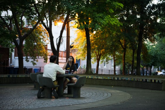
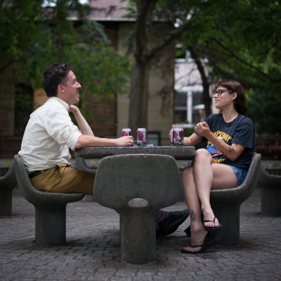
Michael Renaud & Anna Cerniglia are friends as well as contemporaries. The former is creative director of Pitchfork Media, charged with keeping the features fresh & interactive on the compendium of music criticism, Pitchfork and the film criticism site, The Dissolve; designing & launching a new print publication, The Pitchfork Review; and devising & executing the visual theme for the annual Pitchfork Music Festivals in Chicago & Paris. The latter is founder & director of Johalla Projects, a collective space and gallery in West Town, Chicago. Johalla also receives commissions for public art and has answered with large-scale projects for the Chicago Transit Authority and various music festivals. We asked the two curators/tastemakers if we could listen in while they chatted. We offered beer & weird snacks to convince them further.
A discussion of the accessibility of art emerged from the request they cover a few topics: the process of selecting artists and work to fit a space, the relationship between filling a gallery wall and the less tangible computer screen, and the quest for original inspiration in a world saturated with visual imagery. We met them in a very public place: a park. Oh, and it was summer then.
I. On what they do
M: Okay, let’s guess what each other does. Because this will be hilarious. Sometimes when Anna’s come to Rational Park [Renaud’s shared office space], she’s like, okay, so you are a graphic designer?
A: I’m like, what does he do when he’s at work? Wait a minute, he has his own company though. Mister? Mister Mister?
[both laugh]
A: I don’t think I do know. You’re the creative director of Pitchfork [Media], which means that you deal with marketing and creative design of how the company runs. You have your own graphic design company. And…you wear shoes. A shirt. And I don’t know.
M: I do wear a shirt. No pants, though. That’s pretty good! Yeah. I think my job title is weird because I think it means something different at every place. Anyone who has that job title, it means something different. And our company is really unique in a lot of ways, so I just kind of do a lot of things within the company that hopefully help fill a gap.
A: But you own your own company.
M: Yeah, I do!
A: It’s called Mister Mister.
M: [laughs] It’s called Renaud Co. About 7 years ago it was called Mr. Design Co., which are my initials. And that’s cool! I have an office at Rational Park, where you’ve done shows. But I’m at the Pitchfork office now, like four days a week.
When I started freelancing for them, they had no in-house designer, so from that perspective, I’ve watched the company grow and have personally tried to push both myself and the company however I can where design is concerned. The design department is now three people including myself, and I’m proud of how it’s grown but also how lean it is considering everything we’re responsible for.
In addition to everything that goes into making the site happen day in and day out, we’re now associated with similar tasks with our new film site The Dissolve, our two festivals (in Chicago and Paris), and a few other really exciting upcoming ventures.
A: I didn’t know you freelanced with them first, and then you’ve taken up that role by being there for so long! What do I do?
M: What do you do. You are Anna. You grew up in the suburbs. You run Johalla Projects, which is a kind of… It’s not an art gallery, but it is an art…representation? I think you promote artists. And I think you promote local artists especially. Part of your job is that when you curate certain things, or you find people’s work that you like, I think you find it interesting to find where that belongs and then you try to make that happen. You have relationships with galleries around town, and spaces in general, and people that have some kind of reasonable clout with, like, outdoor spaces, so, some aldermen and stuff. And I think you grease some palms Chicago-style.
A: That’s true.
M: You get some crony-ism going. And you have a home base, a place you sometimes do show work, but it’s also kind of your office and storage and stuff.
A: Yep. It’s true.
M: Pretty good?
A: Pretty good!
M: I mean, what’s your title? President of Johalla Projects?
A: I like what I do and I just want to do it. And when people are like “Are you the CEO of Johalla?” I’m like, “What the fuck does that mean?” I made artwork since I was 13 until a few years ago. I had to give up making artwork to focus on Johalla. Now, I think I’m an advocate for the arts. I want to support art as much as I can.
I’m the director and the founder of Johalla Projects, which is an exhibition space, but I’m a promoter of public art and artists in general. We don’t represent anybody, and I don’t want to. That ties down people too much.
II. Curating the Public Space
A: I choose those awkward spaces. Like with the train stops. Like all of these people who might never go into a gallery have to see this. I think people need it outside of the space more than they need it in the space, so I try to get art into places where people don’t think it should exist.
M: Is that a big part of how you choose things? Like thinking about the people who will see them?
A: Even if it’s subconscious, that’s why I lean more toward Ryan Duggan, or Don’t Fret, or people that have something to say. And that might be kind of funny at the same time. How other way to tell somebody about their life, than you know, to make them laugh a little bit? You know, “It sucks, oh, ha ha ha,” and then they go home and cry. It’s interesting.
Using humor makes the path a little bit easier, to approach it. People get it more than you think they do. You don’t need to write it out for them.
M: Simple things are the funniest things.
A: As a designer, are you simple?
M: Yeah, I’m a simple man.
A: Is that a Pearl Jam song?
M: Yeah! Yeah, that’s something I think about a lot – taking things away. Simplicity isn’t necessarily a design goal, but my design process always starts with function and problem solving, so aesthetic concerns are always informed by that. I’m self-taught as a designer, and began by designing for one-color printing and screen printing, which poses just so many limitations. And I’m grateful for that. Because it made me think in terms of basic composition and being effective with not very many bells and whistles, and designing with so many restrictions can be freeing in that way.
And a lot of times when you figure out that function and are communicating with your project on a base level before styling it, you realize you don’t need to add any “art” to it, because it’s working really well on it’s base level, which probably often comes off as looking pretty simple I guess.
I am drawn toward things that work well and serve a purpose perfectly, doing so without too much affectation.
A: I’m starting to realize we have a similar role. You know, it’s up to you to make the design that’s either going to be comfortable for someone to approach, or uncomfortable. That’s a lot of pressure!
M: The thing I like about your approach, too, is that you have a very “for the people” mentality… “I will put it in this neighborhood where anyone can see it, because, why shouldn’t everyone see it?”
III. Taking Risks
M: We both want something to happen. Either you’re thinking about a project or you’re thinking about an idea or whether it’s the smallest little thing or the ethos for an entire organization. The idea of thinking of yourself as a maker.
You want something to happen, and do whatever it takes to make that happen. It doesn’t mean you have to do it all. It means you imagine it and figure out how it’s done. I think that’s what young students should know, especially graphic designers, it’s maybe not enough to be a graphic designer. I’ll say it.
You should be really, not only intuitive, but knowledgeable and book smart on certain graphic design things. At the end of the day, if you’re a good graphic designer, and you want something to turn out well, you’re also going to figure out how to do video, and photo, or at least know people that do that stuff, and be able to work well with them. And find people like you, who can help orchestrate events and marketing initiatives. If you want to do good work, you pretty much have to do everything these days.
A: It’s true. People are really afraid to just do something. The most successful projects have been people not giving a shit. Just doing it.
M: Totally. If you get a bigger assignment than you’ve ever had before, or you’re trying to make something bigger than you’ve ever made before, it means there’s stuff you’re learning for the first time. It’s scary, because you think “I might fail if I do this.” When you get out of it, either you fail and you learned how to do that thing, or you didn’t fail, and holy shit.
A: Just do it. If you do something, someone will notice. I have a lot of friends who are like “I’m doing this project in my basement,” and then suddenly there’s a Tribune article about it.
IV. The partnership between musical art and visual art
A: Do you make art?
M: I used to. I used to consider myself an illustrator. I used to draw a lot.
A: And why music? Because you’re the creative director, are you more interested in the artistry, or are you excited about the bands?
M: Oh, I’m definitely excited about the bands. I mean, I thought of myself as a musician way before I ever thought of myself as a designer. For a long time I was making our fliers, and our posters, and our tape covers, and our CD covers, and other friends’ posters. I taught myself how to screen print in high school. I was doing all that stuff, and loved it, and thought it was so fun, but I never consciously thought that was a thing that I could do for work.
I wanted to be a musician, but I gravitated toward that stuff a little more. I really enjoy working with the artists that we do work with, and I get inspired by them. With Pitchfork, musical trends (especially considering aesthetically-concerned music) are inherent in the work I do, I have to be able to visually understand these genres and worlds and scenes that are happening. Even if I don’t want to be derivative of any of it, I have to be aware, y’know?
But I considered myself a musician and songwriter before I ever identified as a designer, so that was my touchstone for what a creative process was supposed to be like from the beginning.
A: I was at a studio visit (I won’t say whose) but he said that a lot of his work is inspired by the band Sleep. And that was funny, because it’s my fucking favorite band. That is a band I would listen to that would help me get to the next step. And meeting somebody who had the same mentality was interesting. They [musical & visual art] go together. I’m going to use Bjork’s set as an example. That should be how everything is. Everything should be an installation. We should be sitting in a bed of plastic flowers right now. And I don’t know why we’re not.
M: I told them to bring plastic flowers.
V. Curating the Personal Computer
M: You talk about these different spaces where you put art. Does putting art on the Internet ever cross your mind? If you find anything that you like, do you think of that as an atmosphere for art?
A: I think people should touch installation. It’s more of a physical experience. But there have been some really great websites that make you jump out of your chair. I think that people can take a simple message and run with it, but I also think people need a lot in their face in order to take something away. I’ve seen some websites that are put together artistically – like animated gifs and rainbows – where people will be like “this is a really great piece of art.” I’ve bought screensavers as a piece of art.
M: That’s interesting. You’re not a person that’s on the computer that often. It seems like you’re not inspired by it as an atmosphere. But I know people who spend almost all their lives on the Internet. They work with it, and then they continue to be on it, consume media through it, and communicate with people through it. And I think those people might view it as an atmosphere in which to have their minds blown by art and feel it in more of a tangible way than someone who is, I don’t know, in the real world.
A: There are a lot of websites that have a lot of artistic, underlying meaning, but I think I’m more physical. I want to see tangible items.
M: Absolutely. I think for the majority of people it has such a higher impact, but even more so you’re able to reach a diverse group of people, whereas there are certain ways of making art on the internet that are really great and exciting and probably inspiring a lot of artists who make tangible work, but it’s for people that have Macs and updated browsers.
A: Here’s the funny thing. Recently somebody asked me to be on a panel for public art. They told me who was on the panel and I thought, half these people don’t produce public art, they just think about it a lot. So I suggested that they put a street artist on there. They were like, “Why should we do that?” And I thought, this is the best way to market yourself, to be a street artist. Then to create an Instagram, a Facebook, hashtag yourself, and create this weird persona on the Internet.
There have been artists, like Sirius Fountain, with all the black and white faces. And what he did was go city to city, paste his art on popular corners. People walk past them, someone tags him one day, people find him on Instagram, he builds a shop online, and there he is, selling tons of art.
There’s this one guy who used to live here, his name’s Brad Troemel. He has the best online presence. He updates every day, exposing people to new art every day. Takes a certain personality to do that.
VI. “The MBA is the new MFA.”
M: You’re very conscious of marketing when you’re doing stuff. And I know you have to be for what your role is. I think a lot of people view marketing in the art world as…
A: Taboo?
M: Taboo because it’s a capitalist venture and it’s not pure, but at the same time, aren’t you saying it’s just like a vehicle? And at the same time you’re just wanting to use it effectively because you believe in the art. That’s the whole thing. The more people that see it, the more impact it makes.
A: The idea of selling out – when we get sponsored by, like, Scion. This was like three years ago. I used to talk to classes and some punk kid would be like “don’t you feel like you’re selling out?” And I’d say, “Well they’re going to spend the money somehow. Wouldn’t you rather have it be spent on art?”
M: Right. We get the same shit for the festival. It’s funny. Nine years ago, the amount of festivals compared to now… now every town has like three festivals at least. The competition is insane, and expectations from organizers and brands have gone up so much. Our stages are not, like, “the Bud Light stage.” It’s the Red Stage. There’s still a real actual effort on the organizers’ parts for keeping it an experience and keeping it legitimate and incredible. At the same time, we have to pay all those people who are working for us.
A: And what if [the sponsors] didn’t give [the money] to you guys? Who would they give it to? I’m not too proud to call a sponsor.
Our new website has a shop, which is taboo in the art world. I care a lot about marketing, I care a lot about PR, I care a lot about the setup. This probably comes from me being at SAIC the past two years, where everybody wants to talk about theory. I teach a class at SAIC with a lawyer. It’s all marketing. It’s all promotion. It’s all art in the real world. People get caught up in the idea of what an artist is and what art is that they kind of forget everything you need to do to stay mainstream. Or stay relevant. We get a lot of rebellious students, but a lot of the students are also happy to be there.
M: You’re very aware of trying to remain elegant and sophisticated as a gallery, but at the same time, [some people say] “If I can’t buy it, then I’m not interested.
Is that becoming more of a thing in the art world, you think? Sponsors are trying to get so creative these days because ads don’t work like they used to. It’s all about making content and being integrated into editorial. I would imagine that brands are really being tenacious in how they get out there.
A: Amazon is selling art. Urban Outfitters is selling art. And that is why I did it. If these guys are selling art, fuck trying to be sophisticated. If I’m producing these big pieces, then we might as well sell art online, too. I think you can really go places online.
The MBA is the new MFA. I don’t know if it’s ad agencies or whoever makes their ads – they’ve gotten to this point of losing creativity, so because of YouTube and the Internet, they take these phenomena and use them in their ads.
Like AT&T stole the Christo and Jean-Claude idea, and they never asked them. And they sued.
And there are other cases of where artists get their work stolen. Advertisers go to Flickr and take images. Because somebody can become popular on the Internet on their own, companies use these people to be in their ads, or as their creative team, or star in their own TV show.
We’ve been in think tanks with companies. We’ve said “This is what’s cool now.”
If you’re not creative with the way you’re presenting the product, and that can be anything, like Coca Cola can, or a piece of art, if you’re not creative in the way you present it, people don’t notice it.
VII. Curating the Festival
M: I am wondering about attention span and thinking about ten years ago compared to now. How does the Internet affect you? Is anything you do a response to the Internet, cell phone culture. Do you work extra hard to keep things real life because you want that to still exist?
A: Maybe because of the Internet, and people’s short attention spans, I like to work bigger. More in your face. These projects are like 100 feet long. And it’s like, “Experience this moment. This is the best moment of your life.”
M: Exactly. It’s like, when you have something like a music festival, that has three stages, and tons of people, and people watching, and the music, and the weather that’s hitting you, the consumerism and the sponsorships, it’s like a sensory overload. Having art there is a big proposition because if you have a couple artists that do drawings, it gets lost! I’m sorry, but it does. Flatstock, which we have at the festival, is amazing, and we have over forty vendors but part of the reason it’s awesome is because we have over forty vendors.
A: And it’s far away from the music.
M: That’s true. “These Moments” [Matthew Hoffman, 20′ x 80′ wood typography installation] that you did last year, it was that huge, because you can’t have a dinky piece of art in a setting like that. It doesn’t have the same presence that it may need to. Trying to make a visual impact in a large space such as an outdoor festival without creating a ton of waste or spending an exorbitant amount of money is such a challenge.
When I go to those types of things, the decoration and branding and gross vinyl banners and waste is just, ugh. It’s gaudy and kind of shameful, y’know? I think the biggest impact you can make is actually by taking things away. People could cite that we’re guilty of this to a point, and it’s unavoidable in some instances, but we do what we can there and I think that it goes a long way.
A: We’re doing a mural that’s forty feet by ten feet and it’s a truck container. We weren’t given a choice, it was like, here’s your template. I think artwork in festivals, or owning a gallery or anything you have to present to stay relevant. But when you work in a music festival environment where people are going there to see music. The art installation has to stick out a bit and has to be memorable. You want to be able to add to their experience. I try to use this thought with shows as well. I want the artists we work with to affect our patrons like it affects me.
click to see who
MAKE Magazine Publisher MAKE Literary Productions Managing Editor Chamandeep Bains Assistant Managing Editor and Web Editor Kenneth Guay Fiction Editor Kamilah Foreman Nonfiction Editor Jessica Anne Poetry Editor Joel Craig Intercambio Poetry Editor Daniel Borzutzky Intercambio Prose Editor Brenda Lozano Latin American Art Portfolio Editor Alejandro Almanza Pereda Reviews Editor Mark Molloy Portfolio Art Editor Sarah Kramer Creative Director Joshua Hauth, Hauthwares Webmaster Johnathan Crawford Proofreader/Copy Editor Sarah Kramer Associate Fiction Editors LC Fiore, Jim Kourlas, Kerstin Schaars Contributing Editors Kyle Beachy, Steffi Drewes, Katie Geha, Kathleen Rooney Social Media Coordinator Jennifer De Poorter
MAKE Literary Productions, NFP Co-directors, Sarah Dodson and Joel Craig